“We need to bring learning to people instead of people to learning.” — Elliot Masie
When it comes to digital learning, inclusivity, agency, and personalisation are becoming increasingly important aspects of any learning experience. Digital consumers have come to expect seamless, integrated, user-centered experiences when they’re online, regardless of the platform or purpose for being online, and it’s become increasingly harder to ignore the overlap of this expectation into the digital learning realm.
This emphasis on user-centricity and user experience design as it relates to digital learning is best applied by personalising the content and experience to the learner. In a previous article, the concept of personalised learning and its potential impact on a learner’s experience of your course was explored in depth, so in this article, we’re going to continue exploring this theme.
Generally speaking, the best way to personalise content in an online space, where you may never know who the person on the other side of your screen could be, is by giving everyone who comes across your content the tools to personalise their experience themselves, according to their unique preferences and needs.
Fundamentally, learning designers should want learners to feel empowered by having the agency to choose their learning journey. To achieve a successful personalised learning experience, learning designers need to consider the following essential element: accessibility.
Accessible Learning Enables Reach and Access
At this point, you might ask yourself, ‘doesn’t online content automatically mean that it is more accessible?’ Unfortunately, not necessarily. No matter how engaging your online experience is, it won’t achieve its objectives if it’s inaccessible to some participants.
When it comes to digital learning, the term ‘accessible’ refers to content designed to make it possible for everyone across the continuum of ability to navigate.
Let’s paint a picture of a typical online learning experience to understand better what this means. Imagine your learner, Alex, starting one of the courses you have created online. Typically, they would have to work through a few videos of a narrator talking through critical concepts of the course. They might get a few paragraphs of text and some example images to look through, and finally, the course might pose a series of questions by, for example, asking Alex to select green for true statements and red for false statements.
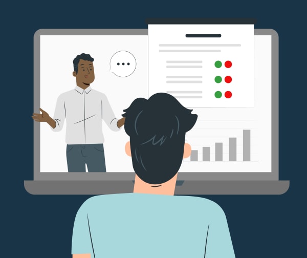
The above explanation unpacks a basic online learning experience, but what might it look like if Alex were differently abled?
If Alex had a hearing difficulty, how would they be able to access the information from the audio narration? Are there closed captions or a script available that they could follow? If not, they will miss out on crucial information they need to complete the course successfully.
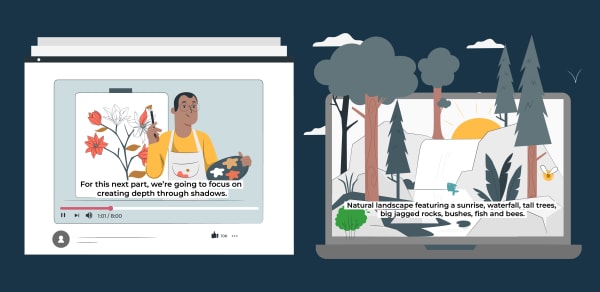
Another example to consider is if Alex were visually impaired. In this case, Alex would be able to hear the audio narration, but would they be able to use a standard screen reading tool to navigate through the images in the course? And would they be able to complete the activity posed to them at the end of the course?
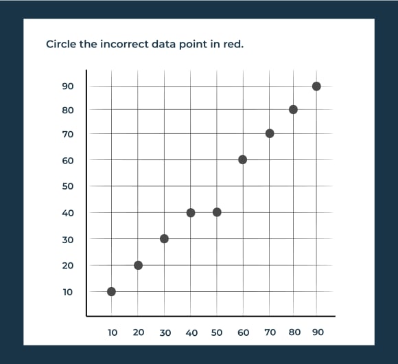
These two examples might be the first that comes to mind when considering accessibility. Still, the breadth and complexity of barriers to learning are extensive — and must be considered. Take, for instance, the assessment activity we used as an example at the end of the course. What if Alex could see and hear all the content but struggled with colour blindness? Alex would be unable to distinguish the red and green options from each other and, therefore, unable to complete the final activity of the course — potentially failing their learning journey.
Creating a Truly Accessible Learning Experience
Creating a learning experience that is genuinely accessible is not as easy as it might initially seem. So, you may ask yourself, ‘how do I even get started?’
As our learners have varying cognitive and physical abilities when accessing content online, it’s recommended that learning designers follow the guidelines and best practices in the Web Content Accessibility Guidelines (WCAG). These guidelines set a global standard for web developers to use when designing online to ensure a smooth and successful user experience for all. And many of these considerations can be directly applied when creating user-centered learning experiences. While these guidelines may seem overwhelming to navigate at first, the first step you’re encouraged to take is to let go of the idea of compliance and focus on usability.
Creators across industries are encouraged to follow the WCAG best practices because it
- provides an internationally recognised standard for accessibility that applies to institutions, websites, and digital learning.
- outlines technical requirements such as the contrast of text to the background and the size of clickable items, as well as providing guidance on how to accommodate specific disabilities.
- ensures that everyone has equal access to content by providing guidelines for creating accessible content. encourages creating content that is intuitive, user-friendly, and universally usable.
Let’s review the four fundamental guiding principles set out by the Web Content Accessibility Guidelines. You can read the complete guidance via the How to Meet WCAG (Quick Reference) resource.
1. Your Learning Experience Should Be Perceivable
Each learner should be able to recognise all the information delivered to them throughout their learning experience, which means that no information should be hidden from any of their senses. How might this play out in reality?
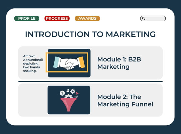
Returning to our learner, Alex, we’ve already discussed using transcripts and subtitling for any learner who may be hard of hearing. Beyond video-based content, any course images (including graphics and buttons) should contain alternative text (more commonly known as alt text), which a screen reader can read for visually impaired participants. Beyond physical ability, using alt text can also benefit those learners whose access to a secure internet connection is not always guaranteed.

Colour is another critical element to ensure that your learning experience is perceivable. If Alex were colour blind, and during the assessment activity was asked to distinguish between data in a graph. The graphic below provides a simple illustration of various colour blindness spectrums and how poor accessibility design choices might impact a learner:
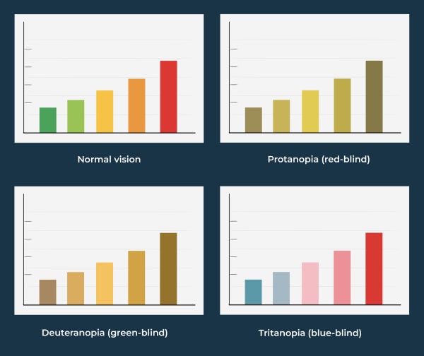
Several tools, such as this colour contrast and analyser, can help you improve your course’s colours by finding more suitable contrasts to meet accessibility standards. Another workaround is to include patterns, text or iconography so as not to rely on colour alone. The graphic below illustrates an accessibility-friendly version of the original graph.

2. Your Learning Experience Should Be Operable
Another fundamental component of accessible digital learning is ensuring that your interface is operable. This includes elements such as interactivities, quizzes, external links and menus. These course elements should be accessible to screen readers and other assistive technologies.
Creating a digital learning experience that is genuinely operable needs to take into account the following (note: this is not an exhaustive list):
- Keyboard accessible: Participants who have trouble using a mouse or typing for extended periods will require their keyboard commands to navigate the platform, just as a mouse would.
- Time limits: Content should be accessible to learners needing more time to read or type. Ensure that your courses include options to pause moving content, view it in a static format, and incorporate extended time limits on any timed activities where possible.
- Sensory overload: Keep flashing elements to a minimum in your course, as this can affect users with epilepsy or other reactions to this kind of content. Similarly, the user should be able to disable animations on the course if needed. Access the free Photosensitive Epilepsy Analysis Tool (PEAT) to test whether your animations may harm some learners.
How could these factors affect a learning experience? Learning experiences can be created using various tools and software, and finding the right one that meets your organisations accessibility requirements can be tricky — but done right, will create an invaluable learning experience for your learners. Let’s consider our persona, Alex, and the Articulate Storyline tool as an example. Articulate Storyline is known to not be a device-responsive tool, however, this doesn’t exclude it from a possible learning tool. To ensure that your interface is operable and accessible, consider the following:
- Can the learning content be read, without error, using a screen reader?
- Have the correct heading levels been set-up within the document styles?
- Do all items include the correct alt text?
- Have decorative elements been excluded from the screen reader functionality?
If you wish to find out more about how Elevate Learning could assist you in creating an accessible learning experience using Articulate Storyline (or other learning tools), then please contact us here.
3. Your Learning Experience Should Be Understandable
Everyone has different comprehension abilities, but all learners should be able to understand the content and how to use the user interface. Here are some tips on how you can improve this level of accessibility:
- Simplify the language used in your learning experience to ensure it is understandable. Include a glossary of terms, define abbreviations, acronyms, and so forth.
- Chunk the text into brief, coherent paragraphs, which will make it easier for a range of learners to follow.
- Label and order course content coherently. Include a table of contents or a breakdown of all the topics/modules. Where possible, allow users to control how they progress through the learning experience, at their own pace and in an order that suits them.
- Ensure automatic input fields are simple and display clear, informative error messages to redirect the learner when necessary.
4. Your Learning Experience Should be Robust
Lastly, your content should be robust. This means it should be compatible with your learners’ web browsers, media players or any plug-ins that help participants with disabilities to interact with and consume the content. Ultimately, the user experience should be equal for those using assistive technology or not.
While this foundational principle specifically targets web developers, as learning designers, we are called to ensure that the robust requirements are being met.
Let’s consider Alex for the final time: a tested, accessible learning environment has been created. However, despite creating a keyboard-navigable environment, Alex’s disability means that they cannot engage with an interactive learning environment. In this instance, create accessible PDF documents that house all the course’s content. You have successfully catered for a wide variety of needs, and have mitigated excluding a learner from gaining knowledge.
Final Thoughts
According to the World Health Organization, around 16% of the world’s population experience difficulties with ability. This is a massive part of our population, and as mentioned, the direction our world is moving in is one of inclusivity and empowerment. Getting a head start at making your content as inclusive as possible will allow you to truly design and develop learning experiences that are user-centered, design-focused and goal-oriented. To help you on your journey towards creating more accessible and inclusive learning experiences, follow these tips:
- Approach: Approach your learning experience design from a people-centered approach, instead of a people-first approach. By appealing to a broad range of learning preferences in the way you design your learning experience, you can create a more learner-centered experience, which will ensure you avoid reducing learners to their categories, and instead, embrace their differences.
- Language: Avoid using defamatory language or characters in your learning experience that perpetuates harmful stereotypes. Keep your language, style and tone relatively neutral and avoid specifically mentioning demographic information (for example, for a persona or case study), unless it is relevant to the content. Similarly in designing graphics, try to include a wide variety of illustrations and character types to ensure all learners feel represented.
- Technology: Take time to carefully consider the UX/UI development of your learning experience — ensuring an operable experience for your learners. Your learning experience should be compatible with different web and mobile browsers. Take the time to carefully test your environment by using assistive tools such as screen readers and voice recognition software. And finally, consider incorporating different user interfaces for learners with visual, auditory, and motor impairments.
And as technology continues to adapt, the Web Content Accessibility Guidelines are updated. Therefore, it is imperative to check for the latest updates in these accessibility guidelines. Remember, equal is everyone getting the same thing. Fair is everyone getting what they need to be successful. And by following WCAG, you can ensure everyone has a fair chance of having a successful digital learning experience.
References
Rhodes, A. (2020) What’s the best font for people with dyslexia?, Extensis. Celartem, Inc d.b.a. Extensis. Available at: https://www.extensis.com/blog/whats-the-best-font-for-people-with-dyslexia
Bozarth, J. (no date) “but it’s to code”: Thoughts on accessibility in e-learning, E-learning Heroes. Available at: https://community.articulate.com/articles/but-it-s-to-code-thoughts-on-accessibility-in-e-learning
(WAI), W.C.W.A.I. (no date) WCAG 2 Overview, Web Accessibility Initiative (WAI). Available at: https://www.w3.org/WAI/standards-guidelines/wcag/
WHO (no date) Disability, World Health Organization. World Health Organization. Available at: https://www.who.int/news-room/fact-sheets/detail/disability-and-health
